

In public realm design, tactile walking surface indicators (TWSIs) serve a vital role in enhancing accessibility and safety for pedestrians with vision impairments. TWSIs provide standardized textured ground surfaces that convey essential navigational cues and hazard warnings through the sense of touch.
Two key types of TWSIs exist—warning tactile and guidance tactile. But what exactly sets these tactile indicators apart? In this blog post, we’ll explore the crucial differences between these two indispensable tactile systems.
Also known as attention or hazard tactile indicators, warning tactile signify potential dangers present along the path of travel. Warning tactile typically feature:
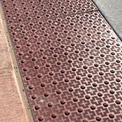
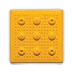
Truncated domes - Small, flattened dome-shaped bumps arranged in a square or radial pattern
High colour contrast - Bright safety yellow or white domes on a dark background
Placement at hazards - Located at platform edges, curb ramps, stairs, changing routes, etc.
Warning tactile’s textured pattern alerts pedestrians to stop, assess their surroundings, and proceed with caution. They notify individuals with vision impairments about impending drop-offs, obstacles, or changes in elevation.
Some prime locations where warning tactile provide vital hazard cues include:
Tactile warning surface indicators along the platform edge prevents accidental slips and falls onto the tracks.
Warning tiles at transitions from sidewalk to street caution users about the level change.
Warning tiles mark door thresholds to indicate the change in elevation.
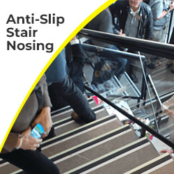
Warning patterns at stair nosings signal upcoming stairs.
Warning tactile defines the crossing point before vehicle routes.
Warning tactile forewarn users of moving staircases.
Guidance tactile, also called directional or code-compliant wayfinding bars, provides orientation cues to guide pedestrians along appropriate circulation routes. Guidance tactile common feature:
Parallel bars - Elongated flat-topped bars running in the direction of travel
Color contrast - Visually contrasts with surrounding surfaces
Placement along paths - Installed along designated pedestrian walkways
The linear bars give pedestrians tactile information about the safe direction of movement and path location. Guidance or tactile wayfinding enables intuitive wayfinding, especially in large open spaces.
Some key locations where guidance tactile solutions direct and orient pedestrians include:
Guidance tactile directs passengers to platforms, ticket counters, exits, etc.
Guidance patterns guide users safely across open plazas and fields.
Guidance tactile leads from entrances to reception desks, elevators, and other areas.
Guidance patterns direct users through sprawling complexes.
Now that we’ve covered both systems independently let’s examine how warning and guidance tactile differ:
Warning tactile caution users about upcoming hazards and dangerous areas.
Guidance tactile guides users along designated safe pedestrian circulation paths and spaces.
Warning tactile commonly employs raised truncated domes in a square pattern.
Guidance tactile typically has elongated raised bars running parallel in the direction of travel.
Warning tactile is located at platform edges, curb ramps, stairs, pedestrian crossings, etc.
Guidance tactile is installed along pedestrian walkways and circulation routes.
Warning tactile signal caution and the need to assess the surroundings before proceeding.
Guidance tactile provides directional orientation cues for intuitive wayfinding.
Warning tactile use bright safety yellow or white for high visibility.
Guidance tactile uses colors that contrast with the surroundings but avoids yellow to distinguish it from warnings.
When employing TWSIs in public realm design, it’s crucial to follow Canadian accessibility guidelines and regulations. Relevant codes and standards include:
Accessibility for Ontarians with Disabilities Act (AODA)
CSA B651 - Tactile Walking Surface Indicators
Ontario Building Code
National Building Code of Canada
Material and structural durability
Standardized dimensions and patterns
Beveled edges
High tonal and color contrast
Strategic placement to convey the intended tactile message
Compliant tactile not only fulfill legal obligations but also create consistently accessible and interpretable cues that enhance public safety.
The two main types are warning/attention tactile, which cautions about hazards, and guidance/wayfinding tactile, which directs along safe paths.
Warning tactile is used at platform edges, curb ramps, apartment/condo buildings, stairs, pedestrian crossings, etc. Guidance tactile is installed along walkways and circulation routes.
Yes, warning and guidance tactile work in tandem. Guidance paths often begin/end with warning tiles indicating upcoming hazards or decision points.
Relevant regulations include the AODA, CSA B651, Ontario Building Code, and National Building Code of Canada.
As Canada’s premier accessibility solutions provider, Tactile Solution Canada offers a wide selection of compliant warning and guidance tactile systems from trusted brands like:
Armor Tile Tactile Systems
Access Tile Tactile Systems
Advantage Tactile Systems
Eon Tile Rubber Tactile
Elan Tile Porcelain Tactile
Engineered for strength, slip resistance, and heavy foot traffic
Customizable with various colors, sizes, and layout options
Compliant with all Canadian accessibility codes and standards
Backed by 5+ year manufacturer warranties
Let our team of experts recommend the optimal tactile systems for your next public project. Contact Tactile Solution Canada today!
